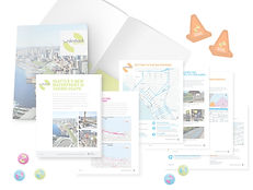
Waterfront Seattle is a program containing 12 projects to develop Seattle’s waterfront. Project materials focused on driving engagement to the website, which could host all the ever-changing design and construction updates. As lead designer, it was my responsibility to manage user experience data collection, all design, content generation, and client review for the brand refresh website.

Needs for New Site
On the existing website, project pages were added as information became available. Including all of the projects on the redesigned website will portray the large scope of the program as well as provide lacking information.
Google Analytics shows the average visit length as 2-3 minutes. Easing navigation and increasing interactivity can encourage users to stay and explore the site longer.
Highlight construction information and social media, the two biggest drivers of traffic to the site.
City of Seattle's Waterfront Seattle
Website Redesign Goals
-
Make important & most often sought-after information quicker to access
-
Gather all construction updates together for one-link access.
-
Highlight projects uniformly as part of a comprehensive whole. No project should feel more important than the others.
-
Create more interactive experiences to encourage longer visits.

Homepage
Translations available in Seattle's 11 most common languages for greater inclusion.
Large visuals invite users in and give context.
Quick links on the home page for finding the most sought-after information.
The 'Join Our Mailing List' direct form in the footer allows for quick newsletter sign-up anywhere on the site.


Project Information
-
Standardized project pages show quick progress overviews of location and timeline.
-
An updated interactive map shows all projects in the program and highlights each project on rollover.
-
New project grid that displays all of the projects at a glance and acts as navigation.
-
Top-level progress is shown through color coding (completed projects are shown in gray) and in a project status timeline for each project.

Construction
A new construction hub shows areas currently under construction, latest updates, and most relevant icon links to resources.

Program Overview
New grid navigation allows users to see all page options at once instead of the previous drop-down menu system. This was helpful to reduce confusion with so many different and atypical categories.

Waterfront Art
A useful interactive map is again incorporated to show the locations of all new art projects.


